
TOP 5 FASHION BRANDS THAT REBRANDED THEIR LOGOS - And Why It Mattered
If there’s one thing we know about the fashion industry, it’s that branding is everything.
In an industry built on visual appeal and identity, even the most iconic fashion houses sometimes need to refresh their face to the world. From minimalist makeovers to total brand overhauls, logo rebranding in the fashion industry is a powerful move that can signal a new era.
Today, we’re taking a look at the top 5 fashion brands that rebranded their logos,who spearheaded the change, and what it meant for their brand image. These are some of the most talked-about logo changes in fashion history.

BURBERRY LOGO DESIGNS
BURBERRY – A Modern Take on Heritage
Logo redesign by: Peter Saville (2018)
Why the Change?
Burberry’s previous logo had stayed largely the same for over a century—featuring a classic serif font and the iconic equestrian knight. While historic, it didn’t align with the digital, fast-paced world of modern fashion.

What’s New?
Under the creative direction of Riccardo Tisci, the logo was completely overhauled in 2018. The new Burberry logofeatures a bold, sans-serif font created by legendary designer Peter Saville, giving it a sleek, digital-friendly look.
Result: The logo change symbolized a clean slate and positioned Burberry as a relevant, forward-thinking brand ready to appeal to younger luxury consumers.
Burberry logo change, modern fashion logos, Burberry rebranding

SAINT LAURENT LOGO REDESIGN
SAINT LAURENT – Dropping the “Yves” for a Bold Future
Logo redesign by: Hedi Slimane (2012)
Why the Change?
When Hedi Slimane joined Yves Saint Laurent as creative director in 2012, he came in with a vision: rebrand the house for a new era. Part of that vision? Stripping the name down.
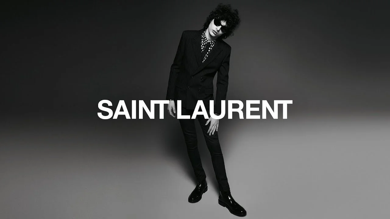
What’s New?
Slimane dropped “Yves” and rebranded the ready-to-wear line as Saint Laurent. The logo was updated with a clean Helvetica typeface, reflecting the brand’s new rock ‘n’ roll minimalism.
Result: Controversial at the time, the Saint Laurent logo change actually helped modernize the brand and attract a younger, edgier audience.
YSL logo change, Saint Laurent logo redesign, minimalist fashion logos

BALENCIAGA LOGO REDESIGN
BALENCIAGA – Simplifying the Streetwear Giant
Logo redesign by: In-house under Demna Gvasalia (2017)
Why the Change?
Balenciaga was transitioning under the creative direction of Demna Gvasalia, who was pushing the brand into the realm of edgy streetwear and ironic high fashion.

What’s New?
The 2017 Balenciaga logo redesign featured a clean, wide sans-serif font inspired by public signage. It was subtle but effective—reflecting the normcore aesthetic and digital-first identity Demna was championing.
Result: The updated logo fit seamlessly into social media branding, packaging, and merchandise, aligning with Balenciaga’s rising influence in pop culture and fashion.
Balenciaga new logo, Balenciaga minimalist logo, luxury streetwear branding

Calvin Klein logo redesign
CALVIN KLEIN – An Artistic Redefinition
Logo redesign by: Peter Saville (again!) under Raf Simons (2017)
Why the Change?
When Raf Simons took over as Chief Creative Officer at Calvin Klein, he aimed to elevate the brand into the world of high fashion and modern art.

What’s New?
Simons tapped Peter Saville to redesign the Calvin Klein logo in 2017. The result? A more spaced-out, all-uppercase sans-serif logo. It was a subtle but noticeable shift meant to reflect clarity, confidence, and cultural refinement.
Result: The logo was short-lived after Simons’ departure, but it became a symbol of that unique, artistic period in the brand’s evolution.
Calvin Klein new logo, Raf Simons Calvin Klein, fashion rebranding examples
BALMAIN LOGO REDESIGN
BALMAIN – A Monogram and a New Mood
Logo redesign by: Olivier Rousteing (2018)
Why the Change?
As Olivier Rousteing continued modernizing Balmain, he wanted a new visual identity that reflected both its Parisian heritage and future-focused direction.
What’s New?
In 2018, Balmain revealed a new monogram “PB” logo, symbolizing Pierre Balmain’s legacy and Rousteing’s modern influence. The typeface was updated to something more minimal and versatile across digital formats.
Result: The Balmain logo rebrand was well received, especially in streetwear and luxury markets where monograms and minimalist logos were trending.
Balmain new logo, fashion brand monogram, Balmain logo change 2018